Faux Painting: The 7
Year Itch
Everyone and every
home wants to be
“…loved, needed, and
wanted.” * It’s estimated that every 7-10 years marriages go through a
change for something new , thus prompting a field of psychological study on
relationships. This thought was brought to the cinema in 1955 by writers Billy
Wilder and George Axelrod in the comedy/romance
“The Seven Year Itch”, made truly famous by Marilyn Monroe’s walk
over a subway vent as her iconic “little white dress” swirls up and around her.
https://www.youtube.com/watch?v=rJ8ZHrp8wac
Relationships with
your home go through similar changes and desires. How often should you refresh
your interior and bring new life and passion into your home? It’s estimated every
7 to 10 years you need a fresh start. Most homes actually change slowly with
little tweaks here and there. For instance: a new paint color in a bathroom,
new curtains in a living room, or a new bedspread in the master bedroom.
Perhaps a few pillows and accessories switched out over the years. But there
comes a point when you want, actually need a complete over haul.
http://southernhospitalityblog.com/decor-longevity-how-often-do-you-redecorate/
In 2015 I had the
pleasure of working with a handful of clients whose homes I had painted and
designed in 5 yrs., 7 yrs., and even 10 years ago! The work I created was still
there, and still looked fabulous-if I may say so myself- but it was time for a
change! A new lease- a new outlook- a complete overhaul! And that’s just what
we did. Here’s a tour of one of the homes:
After looking into the
option of selling their home and moving to a new one, this couple requested I
just make their home look like a completely different new home. Leaving behind
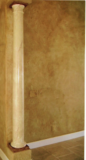
the Tuscan palette of gold, brown, and burgundy we did an about face and embraced
a refreshing palette of white-grey-neutral-with touches of aqua and turquoise. Where
heavy dark furnishings once sat, there are now sophisticated pieces with a mid-century
nod.
We begin our tour in the heart of the home...THE KITCHEN!
The current wood
cabinets were refinished to white on the stove side and soft grey on the sink
side. Additional cabinetry was custom made that accentuates the soaring ceiling
height. To give the room an even airier effect, the upper cabinets have glass
doors- the perfect place to showcase touches aqua and turquoise. The cabinet
hardware was changed to a sleek design in a brushed nickel finish. Dark granite
counter tops were replaced with white granite speckled with grey and black. The back splash is in tumbled stone. The
sink was upgraded to a stunning brushed nickel apron front style sink by Kohler.
The faucet, also in brushed nickel, has a modern profile.
THE LIVING ROOM:
The home is a
townhouse on the second level. As you enter up the foyer stairs, the living
room is the first view you so. One of the biggest impacts in this make over is
the flooring. Formerly in neutral colored square tiles, the rooms appear even grander
and more expansive in porcelain tile planks of Brazilian white oak:
The fabrics on the
cornice board over the glass sliding door to the balcony are in subtle heather aqua
colors:
We kept the fan in
the living room, but the blades have been refinished to a deep rich brown:
View of the living
room from the kitchen:
THE BAR STOOL COUNTER:
The bar stool side
wall and counter are now a central feature with a quartz rock wall. Part of the
beauty of natural quartz is the variety of earth colors it comes in. Care was
taken to select pieces that maintained the homes color palette. Custom wood
brackets are clad over the metal rods that support the counter tops granite and
are painted in the soft grey color of the kitchen cabinetry under the sink.
The bar stools were
custom upholstered in soft heathered aqua.
THE BREAKFAST ROOM:
Cornices and blinds
were change to custom shutters. The table and chairs are custom treated with a
warm grey finish. The chairs are custom upholstered with a playful modern
pattern. The ceiling fans received the same deep rich brown treatment as the
living rooms fans. The former wall covering was removed and the walls now have a
two tone grey faux finish. That same faux finish is carried over into any of
the exposed wall areas of the kitchen.
THE DINING ROOM:
We had so much fun
creating a sleek new dining room prefect for entertaining. Of course, the porcelain
tile in Brazilian White Oak continues. The dining room table rug is reflective
of the beach feel with its waves of deep and light heathered aqua. The table and
credenza are finished in a deep rich brown. The dining chairs have a mid-century
modern curve showing off the beauty of wood tone stria on the backside and
comfortable aqua cushion on the seating portion. White shutters replace the
former cornice and blind treatments. The light fixture and modern wall
sculpture and in brushed nickel.
THE GUEST BATHROOM:
The tropical wall
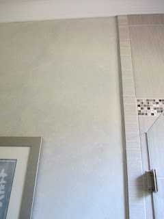
covering was removed and soft grey faux glaze treatment now takes its place.
New custom cabinetry in white was made complete with a custom framed mirror.
The counter top twinkles in a deep grey metallic granite. The shower is
completely redone and now features a frame-less glass door. The new rectangle
shower tiles soar all the way up to crown molding. Extra bling was added by using glass and metallic mosaic accent tiles on the shower wall and floor. Modern brushed nickel finishes
and profiles were selected for the shower, sink faucets, and overhead lighting.
The homes prior short builder grade toilet
has been exchanged for a more comfortable chair height toilet in white.
THE GUEST BEDROOM:
Although the case
goods in the guest bedroom remain the same, the guest suite received a face lift
too. A new wrought iron bed with classic styling replaces the previous tropical
wrought iron bed. The bedding and art pieces are in the soft beach colors
throughout the home.A touch of silver is added to the room by placing mercury glass lamps on the bedside tables. A gorgeous carpet in horizontal ripples of beige and grey
now grace the floor. The walls were painted in a warm grey-taupe tone. The
windows were brightened with white shutters.
THE FAMILY ROOM:
The family room’s French
doors were removed to allow the room and flooring to flow seamlessly from one
room to the next. Window cornices and blinds were replaced with bright white
shutters. The walls were painted in a warm taupe. Since the white sofa of the
living room can be viewed at the same time as the family room, the family room’s
sofa was selected in soft aqua. The tv. Credenza and end tables are now in more
modern lines. The ceiling fan continues with deep rich brown re-finish.
THE LAUNDRY ROOM:
The upper cabinets
were painted to bright white. The wall-covering was removed and the walls were
faux finished in a warm grey wash. The home owner even purchased a new washer
and dryer.
THE MASTER BEDROOM:
Glamour and comfort
exude from the master retreat, starting with the grey and beige horizontal ripples
of the carpet. The star of the room is
bed with its high headboard in dark wood finish and the headboard wall faux
painted in warm metallic grey and silver. A touch of aqua is accomplished with a settee at the foot of the bed. Modern lamps are placed on either
side of the bed. A large picture window now has a white shutter. A custom made
cornice in neutral tones tops the glass sliding door.
MASTER BATHROOM:
Other than the
kitchen, the master bath is probably everyone’s favorite room to remodel. That’s
certainly true in this home. And what a glorious revision it is! The tile was
replaced with the same porcelain tile in Brazilian White Oak finish used throughout
the rest of the home. The wall-covering was removed. A faux finish in metallic silver
grey was painted onto the walls. White custom made shutters were placed on the
windows. Custom made cabinetry was created for the vanity, featuring a central
tower for extra storage. The counter top and bath tub surround are now both in
a salt and pepper sprinkled granite. The tub was replaced to a white finish.
The tub side and shower were tiled in natural grey marble. The tub back wall,
shower wall, and shower floor are accented in glass mosaic tiles.The shower
tile, like the guest bath, soars up to the crown molding. The builder grade
toilet was replaced with a proper chair height toilet in white. Cabinetry
hardware, faucets, shower heads, and lighting fixtures are all now in brushed
nickel with sleek modern profiles.


THE STAIRWELL:
A flight of stairs greets the homeowner’s and
guests as they enter the town-home. The flooring was changed to what I refer to
as “one of the sexiest floorings ever” (aka the porcelain tile in Brazilian
White Oak finish). Many years back, I had painted tropical plants up the
stairwell and had created a faux marble finish on the handrail and base board.
It was time for a change. The tropical foliage removed and the stairwell walls
are now all in Aesthetic White by Sherwin Williams. The handrail and baseboard
were re-painted back to marble, but in the homes new color palette.
The biggest challenge
on the stairwell was changing the accent lighting. Using a team of 4, the old
lighting was removed. New modern profile pendant lights were hung. But only
after custom crown ceiling mounts were made allowing for the square bases to
cover the previous round space cut by the original builder for can lighting.
Joel installing new
lighting:
A special big thank
you to my crews who made this all come to life and who let me harass and "help" them on a
daily basis. ( Scott W., Kevin, Andy, Scott G., Joel, Bob the Builder, Cris, Eric, Kathy)
Photos courtesy of Swan Studios Inc and
David Michael Photography:
http://www.davidmichaelphotography.net/
To have your own home
receive a new lease on life and feel “ …loved,needed, and wanted”*, contact
Swan Studios Inc
http://www.swanstudio.net/
Notes: *line excerpt of Marilynn Monroe’s character , “The
Girl” in the film Seven Year Itch
#mural #murals #muralist #muralpainting #art #artist
#artblog #fauxpainting #fauxpainters #fauxfinishes #fauxartist
#capecoral #capecoralmurals #capecoralmuralist #fortmyers #fortmyersmurals
#fortmyersmuralist #naplesflorida #naplesfl #naplesmurals #naplesmuralist
#naplesfloridamuralist #capecoralfauxpainting #capecoralfauxpainters #fortmyersfauxpainting #fortmyersfauxpainters
#naplesfauxfinishing #naplesfauxpainters #bonitasprings #bonitaspringsmurals
#bonitaspringsfauxpainting #bonitaspringsfauxfinishing
#bonitaspringsfauxpainters #sherwinwilliams #homemakeover #martywisher #swanstudios #swanstudiosinc


